

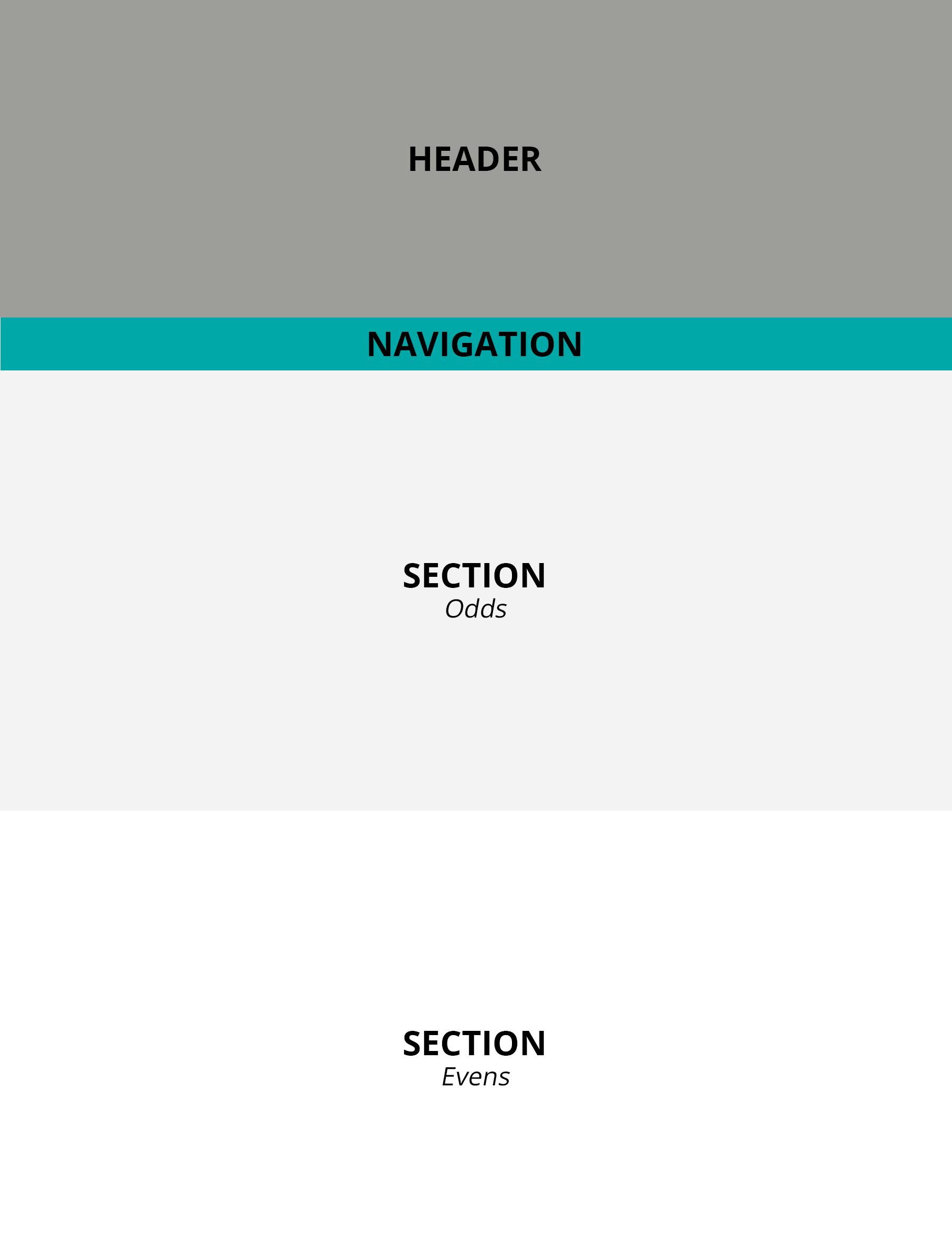
The eCore template is based on a sectioned layout.
The first two sections are the header and navigation sections: The header is where the page's title will live while the navigation section will be generated at page load based on the content of the page. This means that the navigation section will not appear in the template's HTML until the page is being viewed.
The remaining sections are where the page's content will live. These sections are designed to alternate in color, so the even numbered sections will be eCore's standard light gray color while odd numbered sections will be white (see Colors for more details on the Standard eCore Colors).
While this general layout defines the overall template, know that it does not have to define your content: Various types of subsections have been designed for your use and can be placed inside these content sections to help organize your content. To better familiarize yourself with how content can be better laid out and what you can and can't do, see the next section on template Features.
Because of the template's design, many features and some content may not be editable in the base HTML editor. As a general rule, it's best to use the WYSIWIG editor strictly for adding, editing, or deleting text. For instance, a couple of examples of where the WYSIWIG editor will not properly generate the desired outcome and/or may break the template's look and feel if used include:
Because these are hidden by default, they will not appear in the WYSIWIG editor. Editing and/or creating these will require the use of Source Code HTML editor, or the supplemental Accordion Generator to be provided along with this template guide.
These require a special multimedia wrapper to maintain their responsive design, so the WYSIWIG editor will be unable to create a true multimedia section. Editing and/or creating these will require the use of Source Code HTML editor, or the supplemental Multimedia Generator to be provided along with this template guide.
While these are only two examples, there are likely many other instances where the WYSIWIG editor will fall short. That's why it's important to familiarize yourself with how the HTML of the template looks and works, so you can maximize the template's capabilities and make use of all its built-in features. Below is a simplified version of how the template's base HTML is built:
<html>
<body>
<leader></leader>
<header>
<background></background>
<content>...</content>
</header>
<section>
<heading></heading>
<content></content>
</section>
</body>
</html>
Upon further inspection, you'll notice both a header and section tag. These designate the header section and a single content section, respectively. Remember, the navigation section is only inserted on page load, so you will not see it in the base HTML if you were to view it in the Source Code editing window. However, a section on the dynamically injected nav bar, as well as the dynamically created floating side menu, has been included below for completeness.
In any HTML document, the body tag is always the wrapper for all visual elements of the page. In the eCore template, the body tag has been modified to accept four custom attributes as follows:
<body color1="" color2="" btncolor="" btnhover="">The primary color for the template's color scheme.
The secondary color for the template's color scheme.
The amount of tint (lightness) for all navigation buttons. By default, this value is set to 10% if undeclared.
The amount of shade (darkness) for all navigation buttons on hover. By default, this value is set to 10% if undeclared.
The leader section is an optional addition to your page, which can be used for displaying things like lesson or chapter numbers or even for creating breadcrumbs. When included, the leader tag should always be nested just inside the opening body tag immediately before the opening header tag, making it the first child of the body element. Do note, the leader tag is only intended for accepting inline-elements, such as text and links. In addition, each leader tag has three custom attributes as follows:
<leader type="" lang="" cont="">The prefix to be added to the leader text. If this value is undeclared, by default, no prefix will be added.
The language of the prefix to be added to the leader text. If this value is undeclared and a type has been set, by default, prefixes will be in English.
The suffix to be added to the leader text to indicate a continuation. If this value is undeclared and a type has been set, by default, the suffix will not be added.
The header section can be identified by the header tag. Inside this header tag are two additional tags: a background tag, which is used to for the header's background, and a content tag, which is used for the page's title and subtitle. The background of the header section, is made up of three additional tags as follows:
<background>
<img/>
<colorize></colorize>
<pattern></pattern>
</background>
These three tags essentially act as layers, which create the desired background effect. The first tag, img, is used for a background image. The second tag, colorize, is used to add a color overlay overtop of the background image or to specify a solid background color in the event that an image is not used. Lastly, the third tag, pattern, is for creating a textured layer overtop of the other layers if desired.
The img tag has been modified to accept the following standard and custom attributes:
<img src="" alt="" valign="" desaturate=""/>The source of the image.
The text alternative to the image.
The vertical alignment of the image within its container. By default, this value is set to middle if undeclared and an src is given.
The amount of desaturation applied to the image. By default, this value is set to 75% if undeclared and an src is given.
The colorize tag has been modified to accept the following custom attributes:
<colorize bgcolor="" opacity="">The background color of the element, for use as a solid or overlay. By default, this value is set to ecore-light-grey if undeclared (see Colors for more details).
The amount of transparency applied to the element. By default, this value is set to 50% if undeclared.
The pattern tag has been modified to accept the following custom attributes:
<pattern src="" opacity="" align="" valign="" size="">The source of the pattern.
The amount of transparency applied to the pattern. By default, this value is set to 100% if undeclared and an src is given.
The horizontal alignment of the pattern within its container. By default, this value is set to auto if undeclared and an src is given.
The vertical alignment of the pattern within its container. By default, this value is set to auto if undeclared and an src is given.
The size of the pattern relative to its original size. By default, this value is set to contain if undeclared and an src is given.
The navigation section is dynamically injected into the page and cannot be viewed or manipulated in the source HTML code. Each button on the nav bar is created based on each section included in the page. The text in the button is pulled from the first detected title tag (h1, h2, h3, h4, h5, or h6) in the section element's heading, and any section lacking a title tag will not be given a button on the nav bar, which may be desireable for introduction or transition type sections. Additionally, to ensure that longer titles are neatly displayed inside button elements, a plugin has been installed to truncate longer titles with ellipses when the text begins to wrap or overflow (see the Plugins section for more details). This all happens at page load. A sample of what the markup for the nav bar looks like can be seen below:
<nav>
<button></button>
<button></button>
<button></button>
<button></button>
</nav>
The floating side menu is dynamically injected into the page and cannot be viewed or manipulated in the source HTML code. Each button on the floating menu is created based on each section included in the page. In addition, a Top and Bottom button is added for quickly scrolling to the top or bottom of the page, respectively. The text in the button is pulled from the first detected title tag (h1, h2, h3, h4, h5, or h6) in the section element's heading, and any section lacking a title tag will not be given a button on the floating menu, which may be desireable for introduction or transition type sections. Additionally, to ensure that longer titles are neatly displayed inside button elements, a plugin has been installed to truncate longer titles with ellipses when the text begins to wrap or overflow (see the Plugins section for more details). This all happens at page load. A sample of what the markup for the floating menu bar looks like can be seen below:
<menu>
<button></button>
<button></button>
<button></button>
<button></button>
</menu>
Content sections can be identified by their section tags. Each section tag has been modified to accept three custom attributes as follows:
<section image="" fit="" shape="">The source to an icon or other image.
The size of the image relative to its original size. By default, this value is set to 100% the original width if undeclared and an image is given.
The shape of the image. By default, this value is set to circle if undeclared and an image is given.
Inside each section tag is two additional tags: a heading tag, which is used for a section's title and subtitle, and a content tag, which is used for a section's content. Thus, the base HTML markup for a section looks like the following:
<section>
<heading></heading>
<content></content>
</section>
The heading tag is a container for each section's header text and/or subheader text. Respectively, the header and subheader elements include:
For best aesthetics, each header element should be paired with its corresponding subheader element. That is, h1 should always be paired with sh1, and so forth.
The content tag is where all your section's content and text will be stored and where any additional layout or visual elements, such as subsections, boxes, accordions, multimedia, and so forth, can be used. The following sections outline the types of content that can go inside a content tag:
Text is the most common type of content that will be used. Text content can be placed directly between the opening and closing content tags without being wrapped in paragraph (p) tags, or p tags can be used to create some additional space between paragraphs of text. By default, the WYSIWIG editor will place paragraphs of text in p tags or insert two line breaks (br) to simulate the look and feel of separate paragraphs, but beware that the WYSIWIG editor will also add additional paragraph tags or line breaks when and where unnecessary. Here is an example of what the corresponding markup would look like for pure text content:
<content>
<p>Some text here.</p>
</content>
While text content is the simplest form of content available to you, it doesn't necessarily have to be the dullest. For instance, built into this template are ways to make text a bit more interactive. Below is a list of features that can be applied to text content:
When creating text-based content, it's likely that text contains various vocabulary words, which will need to be defined somehow, either inline or later on down the road. While textbooks and other print resources often use glossaries to define important vocabulary words, we realize that the use of a glossary that has to be referenced frequently is highly impractical when it comes to web-based applications. For this reason, a custom plugin has been developed to enable an instantaneous definition lookup for vocabulary words when a given term is moused over or focused on (for more details see the Plugins section). In addition, clicking the vocabulary word will generate a separate popup window with the term's full definition.
To utilize this feature, a custom define tag has been setup. To enable a definition lookup on a given term, simply wrap the vocabulary word in a define tag, then fill in the define tag's custom xmlsrc attribute with a link to an XML document containing the term's definition and, optionally, fill in the corresponding term attribute as well. As a point of reference, the define tag and its custom attribute are as follows:
<define xmlsrc="" term="">The source to an XML document containing a list of definitions. If left undefined, the definition lookup will not work.
The exact term matching an entry in the relevant XML document. This attribute is optional but should be set if the term inside the opening and closing define tag varies from the exact word or phrase listed in the relevant XML document.
The template's definitions feature makes use of XML (standing for Extensible Markup Language), which is a human- and computer-readable language that closely resembles symantic HTML5. For the purpose of creating a vocabulary list, a single XML (.xml) document can be used to store an entire glossary of terms, where both short definitions (meaning-short) and long definitions (meaning-long) can be stored. The base format for all XML files intended for use with the template's definitions feature should resemble the following, where a single definition tag encapsulates a single vocabulary term and its meaning(s), and each definition is nested inside the encompassing definitions tag:
<?xml version="1.0" encoding="UTF-8"?>

<defintions>

<definition>
<term>insert term here</term>
<meaning-short>insert a short meaning here</meaning-short>
<meaning-long>insert a long meaning here</meaning-long>
</definition>

</defintions> Below is a live example of how a definition looks and how the feature works:
This is a sample vocabulary
Lists are a standard HTML element, and the WYSIWIG editor comes with a button for creating them easily. However, the eCore template has upgraded its lists with a few built-in features that cannot be accessed through the WYSIWIG editor. To use these features, editing the list's HTML will be required.
For instance, if you want to give your list a title or if you want to designate a subtitle for a sublist, custom lt and ls tags have been setup for your use where the lt tag is for list titles (bolded without a marker plus some additional styling), and the ls tag is for sublist subtitles (bolded with a marker). An example of how both of these can be used is as follows:
<content>
<ul>
<lt>List title</lt>
<li>List item</li>
<ls>List item and sublist subtitle
<ul>
<li>Sublist item</li>
</ul>
</ls>
</ul>
</content>
In addition to the newly added list title and list subtitles, all unordered lists (ul), ordered lists (ol), list items (li), list titles (lt), and list subtitles (ls) can be given custom markers using the marker attribute. Here is an example of what the corresponding markup would look like for a simple list with a custom marker:
<content>
<ul marker="circle">
<li>List item</li>
</ul>
</content> The marker by name.
In addition to standard lists, other list styles have been created for your use. To learn more about the additional list options available to you, see below:
Sometimes, adding keywords may be necessary after a body of text to help make skimming a page or finding specific key terms on a page easier. The template has been setup to allow unordered lists (ul) to accommodate for these keywords lists. To format a list as a set of keywords, simply add classkeywords to your ul element. When the class is added to a ul element, the keyword list will resemble the following example:
Various types of media can be inserted alongside text without using a multimedia container (see the following sections for more details about multimedia containers). This approach is best suited for creating a text wrap effect or when you wish to directly relate text content with some media. Commonly used types of media include:
These media objects have been modified to accept the following custom attribute as shown below on a sample img tag:
<img float="" lspace="" rspace="" />The position of the media relative to any wrapped text. By default, this value is set to none.
The left spacing to be added to the media. By default, this value is set to 20 when floatright or 0 otherwise.
The right spacing to be added to the media. By default, this value is set to 20 when floatleft or 0 otherwise.
Though the WYSIWYG editor offers a similar float option, do note that the results produced by the float attribute differ drastically from the effect that will be produced by the WYSIWYG editor. This is due to the WYSIWYG editor not being able to compensate for changes to the template's layout. It is recommended that you use the float attribute directly for creating text wrap effects instead of any options given in the WYSIWYG editor. Otherwise, undesireable results may occur.
The sections below go into a bit more detail about how to handle and further customize various types of media:
In some instances, captioning your media may be desired and/or attributing your media may be required by the media's license and/or source. For these reasons, captions and attributions have been built into the template. However, not all types of media as previously mentioned will accept captions and attributions. As a point of reference, captioning and attributing can be applied to any of the following types of media elements regardless of whether or not they are within a multimedia container (see the following sections for more details about multimedia containers):
Captions and/or attributions can be achieved through the use of a special class and custom attributes, where the class is required for any captioning and/or attributing to take effect. The end result with captions and/or attributions applied is achieved on page load by wrapping the media element in a figure tag, nesting the caption and/or attribution inside the figure element as a figcaption tag, and apply additional styling to achieve the desired effect.
For media elements that you wish to add captions and/or attributions to, the mandatory class and custom attributes are as follows:
<img class="caption"
caption=""
caption-src=""
caption-state=""
caption-mode=""
attribution-state=""
license=""
license-src=""
by=""
from=""
from-src=""
copyright-owner=""
copyright-year=""
derivative="" />
The caption to be displayed. If no value is given or the caption attribute is missing but classcaption has been set, by default, the contents of the alt attribute will be used instead if present.
The link to be added to the caption. If no value is given or the caption attribute is missing but classcaption has been set, by default, no link will be added.
The visible state of the caption. This can bed toggled to hide the caption when only attribution is desired. If no value is given, an invalid value is given, or the caption-state attribute is missing but classcaption has been set, by default, this value will be set to true.
The style of caption to be used. If no value is given, an invalid value is given, or the caption-mode attribute is missing but classcaption has been set, by default, this value will be set to show.
An example of each caption-mode is show below:


The visible state of the attribution. This can be toggled to show the attribution when corresponding attributes are given (see the follwing sections for more details on corresponding attributes). If no value is given, an invalid value is given, or the attribution-state attribute is missing but classcaption has been set, by default, this value will be set to false.
The license belonging to the media. This attribute requires that attribution-state be set to true. If no value is given, an invalid value is given, or the license attribute is missing but classcaption and attribution-statetrue have been set, by default, this attribute will be ignored.
The license attribute has been setup to recognize a preset group of Standard Licenses. These names can be used as the value in the license attribute. When used, the Standard Licenses will automatically populate the license-src attribute (see the following section for more details) with a URL to the license, wrap the license name with an a link using the license's URL, replace the license name with an appropriate license image if applicable, and set the title attribute of the a tag accordingly. The collection of Standard Licenses, including more details on each, is as follows:
AttributelicenseCC-0
Version1.0
TitleCC 0
Image
AttributelicenseCC-BY or licenseCC-BY-4.0
Version4.0
TitleCC BY 4.0
Image
AttributelicenseCC-BY-3.0
Version3.0
TitleCC BY 3.0
Image
AttributelicenseCC-BY-2.5
Version2.5
TitleCC BY 2.5
Image
AttributelicenseCC-BY-2.0
Version2.0
TitleCC BY 2.0
Image
AttributelicenseCC-BY-1.0
Version1.0
TitleCC BY 1.0
Image
AttributelicenseCC-BY-SA or licenseCC-BY-SA-4.0
Version4.0
TitleCC BY-SA 4.0
Image
AttributelicenseCC-BY-SA-3.0
Version3.0
TitleCC BY-SA 3.0
Image
AttributelicenseCC-BY-SA-2.5
Version2.5
TitleCC BY-SA 2.5
Image
AttributelicenseCC-BY-SA-2.0
Version2.0
TitleCC BY-SA 2.0
Image
AttributelicenseCC-BY-SA-1.0
Version1.0
TitleCC BY-SA 1.0
Image
AttributelicenseCC-BY-ND or licenseCC-BY-ND-4.0
Version4.0
TitleCC BY-ND 4.0
Image
AttributelicenseCC-BY-ND-3.0
Version3.0
TitleCC BY-ND 3.0
Image
AttributelicenseCC-BY-ND-2.5
Version2.5
TitleCC BY-ND 2.5
Image
AttributelicenseCC-BY-ND-2.0
Version2.0
TitleCC BY-ND 2.0
Image
AttributelicenseCC-BY-ND-1.0
Version1.0
TitleCC BY-ND 1.0
Image
AttributelicenseCC-BY-NC or licenseCC-BY-NC-4.0
Version4.0
TitleCC BY-NC 4.0
Image
AttributelicenseCC-BY-NC-3.0
Version3.0
TitleCC BY-NC 3.0
Image
AttributelicenseCC-BY-NC-2.5
Version2.5
TitleCC BY-NC 2.5
Image
AttributelicenseCC-BY-NC-2.0
Version2.0
TitleCC BY-NC 2.0
Image
AttributelicenseCC-BY-NC-1.0
Version1.0
TitleCC BY-NC 1.0
Image
AttributelicenseCC-BY-NC-SA or licenseCC-BY-NC-SA-4.0
Version4.0
TitleCC BY-NC-SA 4.0
Image
AttributelicenseCC-BY-NC-SA-3.0
Version3.0
TitleCC BY-NC-SA 3.0
Image
AttributelicenseCC-BY-NC-SA-2.5
Version2.5
TitleCC BY-NC-SA 2.5
Image
AttributelicenseCC-BY-NC-SA-2.0
Version2.0
TitleCC BY-NC-SA 2.0
Image
AttributelicenseCC-BY-NC-SA-1.0
Version1.0
TitleCC BY-NC-SA 1.0
Image
AttributelicenseCC-BY-NC-ND or licenseCC-BY-NC-ND-4.0
Version4.0
TitleCC BY-NC-ND 4.0
Image
AttributelicenseCC-BY-NC-ND-3.0
Version3.0
TitleCC BY-NC-ND 3.0
Image
AttributelicenseCC-BY-NC-ND-2.5
Version2.5
TitleCC BY-NC-ND 2.5
Image
AttributelicenseCC-BY-NC-ND-2.0
Version2.0
TitleCC BY-NC-ND 2.0
Image
AttributelicenseCC-BY-NC-ND-1.0
Version1.0
TitleCC BY-NC-ND 1.0
Image
If you would like to request additional licenses be added to the Standard Licenses collection, please contact Lauren Hamel at lauren.hamel@ung.edu.
The source of the license. This attribute requires that attribution-state be set to true and that license attribute is set. If no value is given, an invalid value is given, or the license-src attribute is missing, with or without the license attribute being set and with the classcaption and attribution-statetrue having been set, by default, this attribute will be ignored.
The author of the media. This attribute requires that attribution-state be set to true. If no value is given or the by attribute is missing but classcaption and attribution-statetrue have been set, by default, this attribute will be ignored.
The website name of the site the media was retrieved from. This attribute requires that attribution-state be set to true. If no value is given or the from attribute is missing but classcaption and attribution-statetrue have been set, by default, this attribute will be ignored.
The source the media was retrieved from. This attribute requires that attribution-state be set to true. If no value is given or the from-src attribute is missing but classcaption and attribution-statetrue have been set, by default, this attribute will be ignored.
The copyright owner of the media. This attribute requires that attribution-state be set to true. If no value is given or the copyright-owner attribute is missing but classcaption and attribution-statetrue have been set, by default, this attribute will be ignored.
The copyright year of the media. This attribute requires that attribution-state be set to true. If no value is given or the copyright-year attribute is missing but classcaption and attribution-statetrue have been set, by default, this attribute will be ignored.
The derivative status of the media, used to indicate whether or not the media is a derivative. This can toggled to add a (derivative) suffix to the attribution. If no value is given, an invalid value is given, or the derivative attribute is missing but classcaption has been set, by default, this value will be set to false.
Embedding videos is a great solution for quickly and easily adding video to your content without knowing the exact HTML markup for including a video from scratch. While it may be easy to copy-and-paste an embed code into the HTML of your page, bear in mind that it's not always as simple to make these videos mobile-friendly. It's common practice for video service providers, such as YouTube and Vimeo, to use iframe objects as a container for any video content. However, iframe elements present some challenges: Because they are designed to be fixed-width and fixed-height objects, attempting to set width100% for an iframe would only cause the iframe to scale disproportionately rather than making it responsive.
To solve this problem and make it possible to proportionately scale iframe videos next to text—for instance, when wanting to set a floated YouTube video's width to a percentage in order to achieve a text wrapping effect—a special set of custom attributes can be used on the iframe tag to achieve an auto-scaling effect. This works by always resizing the iframe video relative to its original aspect ratio. To enable this auto-scaling effect, first, set the width attribute of the iframe object to the desired percentage, then add in the custom attributes as follows:
<iframe width="" origwidth="" origheight="" autoscale>The original width of the iframe. Usually, when copying-and-pasting an embed code from a video provider, the default width attribute of the iframe object will contain the value of the video's original width. Simply move that value into the origwidth attribute instead, replacing the width attribute value with your desired width in percents.
The original height of the iframe. Usually, when copying-and-pasting an embed code from a video provider, the default height attribute of the iframe object will contain the value of the video's original height. Simply move that value into the origheight attribute instead. You can remove the inital height attribute altogether.
The auto-scale trigger, which indicates that a video should be scaled according to its aspect ratio. If the attribute is not provided, the video will not scale automatically. Providing the attribute enables this functionality.
Subsections can be used to better organize your content. These can be inserted into any content tag using the subsection tag as follows:
<content>
<subsection></subsection>
</content>
Like with sections, icons can also be added to subsections. To add an icon to a subsection, use the image attribute on the subsection tag. Along with the image attribute, the subsection tag also accepts three additional custom attributes. All acceptable attributes are as follows:
<subsection image="" fit="" shape="" position="">The source to an icon or other image.
The size of the image relative to its original size. By default, this value is set to 100% the original width if undeclared and an image is given.
The shape of the image. By default, this value is set to circle if undeclared and an image is given.
The position of the image relative to the subsection. If undeclared, by default, this value is set to left and an image is given.
Similar to the section tag, all subsection tags use subheading and subcontent tags to separate the subsection's title and subtitle from its content:
<content>
<subcontent>
<subheading></subheading>
<subcontent></subcontent>
</subcontent>
</content>
Boxes can be used to better organize your content. These can be inserted into any content tag using the boxes and box tags as follows:
<content>
<boxes>
<box></box>
</boxes>
</content>
The boxes tag is used as a wrapper for all of the box tags, indicating where boxes will start and end and what boundary the responsive box elements should be restricted to. Each box element accepts five custom attributes:
<box image="" fit="" shape="" position="" align="">The source to an icon or other image.
The size of the image relative to its original size. By default, this value is set to 100% the original width if undeclared and an image is given.
The shape of the image. By default, this value is set to circle if undeclared and an image is given.
The position of the image relative to the box. By default, this value is set to center the image to the center of the box if undeclared and an image is given.
The horizontal alignment of text inside the box. By default, this value is set to center the text inside the box if undeclared.
Like the content tags of the section and subsection, the box tag also uses a heading tag to separate its heading and/or subheading from its content. However, the box tags do not use a content tag for their content since only text content inside a box is preferred. Because media elements, like images, videos, audio, and so forth take a longer time to load and resize and would require a bit more coercing to play nicely with our fluid layout, media content can cause some fluctuations to the boxes layout. More specifically, the media elements will not scale fast enough causing the box elements to be larger than ideal. Despite this limitation, boxes are a great solution for configuring text and other elements with a relatively fixed height. A simple example of how the markup of a box would look is provided below:
<content>
<boxes>
<box>
<heading>
<h3>Box title here</h3>
<sh3>Box subtitle here</sh3>
</heading>
Box content here.
</box>
</boxes>
</content> Grids can be used to better organize your content. These can be inserted into any content tag using the grid and griditem tags as follows:
<content>
<grid>
<griditem></griditem>
</grid>
</content>
The grid tag is used as a wrapper for all of the griditem tags, indicating where the grid will start and end and what boundary the responsive griditem elements should be restricted to. The grid tag accepts two optional attributes as follows:
<grid width="" spacing="" >The width of the grid area. By default, this value is set to 100% if undeclared.
The space between grid items. By default, this value is set to 0 the original width if undeclared.
A separate griditem tag is nested inside the grid for each item you wish to add to the grid. Any type of simple content, including but not limited to text, images, videos, and audio, is ideal for use inside a griditem while more complex content, such as boxes or accordions, are not suited for use inside a griditem tag. While the attributes for the grid tag are optional, each griditem tag requires that a width attribute be set. A width for each griditem is mandatory in order for the grid to work as expected. The width of a griditem element can be set using the custom width attribute as follows:
<griditem width="">The width of the grid item. This value is required and must be set by the user. In other words, there is no default, and any undeclared values will cause the grid layout to break.
The grid layout is similar to the boxes layout in that it uses a highly responsive mechanism to size and position griditem elements accordingly. However, it's important to note that grid layouts have their own limitations because they're more or less designed to be "stackable" objects, meaning that they attempt to fill in as much negative, vertical and horizontal space as possible while compensating for the varying widths and heights of the griditem elements given the available space they have to work with. You may begin to notice some of the known limitations the grid layout currently has in the following situation(s):
Though window resizing does not have a dramatic impact on the layout most of the time, frequent resizing and/or big, sudden changes to window size may cause the layout to render inaccurately. This is because the grid layout requires an adequate amount of time to calculate a new layout. When resizing happens faster than the grid can fully process, some overlapping or oddly sized griditem elements may results.
While the grid does its best to find the the "best fit" for all griditem elements, dissimilar widths—or more specifically, widths that do not possess a common denominator—may not render perfectly as anticipated. Bear in mind, it can only do but so much. With that said, using widths that are all in the same units (% or px) and ensuring that all widths are similar in terms of denominators will help ensure that the grid layout renders as best as possible across varying screen sizes.
Despite the aforementioned limitations of grid elements, grid layouts can still be a great solution for displaying content of all types. For example, some uses for a grid layout may include creating a unique spread of mixed-media content or for a photo or video gallery. While the possibilities with grid layouts are virtually endless, it's important to use them with caution. Using several, media-rich grid layouts on a single page can easily reduce template performance, slow down page load, and cause lags while scrolling through content.
Accordions can be used to better organize your content and provide an element of interactivity. These can be inserted into any content tag using the accordion and panel tags as follows:
<content>
<accordion>
<panel></panel>
</accordion>
</content>
The accordion tag is used as a wrapper for all of the panel tags, indicating where an accordion will start and end. Each panel element accepts one custom attribute, which is required for setting up and displaying the accordion properly on page load:
<panel topic="">A short phrase or keyword describing the panel's contents.
Callouts can be used for an excerpt, side note, or call-to-action. These can be inserted into any content tag using the callout and memo tags as follows:
<content>
<callout>
<memo></memo>
</callout>
</content>
In this instance, the memo tag is similar to a content tag in that it's used for holding the text of the callout. Each callout element accepts one custom attribute:
<callout image="">The source to an icon or other image.
When inserting media into the eCore template a majority of the time, a special multimedia container should be used in order to maximize responsiveness and usability across all browsers, platforms, and devices. The exception to when media should not be placed inside a multimedia container is when you wish to have your media alongside your text content. The markup for the multimedia tag will always resemble the following:
<content>
<multimedia>
<description></description>
<media></media>
<transcript></transcript>
</multimedia>
</content>
In the above example, you'll notice three additional tags inside the multimedia tag: description, media, and transcript. The description is used for supplying a brief overview of the multimedia content or can be used to provide instructions to students. If you prefer to have the description display underneath the media instead, you can simply move the description tag below the media tag in the HTML. The media tag is where your media object is actually placed, whether video, audio, image, or otherwise. The last tag, transcript, is used for creating a visually-appealing transcript to go along with your media content. The transcript itself will resemble an accordion.
The multimedia tag accepts one custom attribute:
<multimedia image="">The source to an icon or other image.
The description tag accepts one custom attribute:
<description align="">The horizontal alignment of text inside the description. By default, this value is set to left align the text inside the description if undeclared.
The media tag is setup for all types of media objects. Some common media include:
Some media elements have been highly customized to offer users a more accessible and/or responsive experience. Below provides more detail on the media elements that have been modified:
While the standard HTML5 video player serves its purpose, a more advanced and feature-rich video element has been setup using a custom-made plugin (see the section on Plugins for more details) specific to eCore applications. This plugin not only contains the standard video player controls but also adds features to the video player while enhancing the overall accessible and responsive experience. Some of the added features include but are not limited to:
Users can toggle the video's playback rate, making it slower or faster.
If varying resolution source files are provided, users can change between the different resolutions to optimize the performance of video playback.
If varying language track files are provided, users can change between the different languages to personalize their captions.
In order to permit some of the above features, the required markup for the HTML5 video element has been slightly adapted to meet our needs. More specifically, aside from the source tag's standard src (source file) and type (mime type, commonly video/mp4) attributes, the source tag has also been given a custom resolution attribute used to indicate the source's resolution as follows:
<source src="" type="" resolution="">The resolution of the source file. If left undefined, the source file is assumed to be 1080p.
Unlike the source tag of the video element, the track tag has not been modified. However, it's implementation has been slightly standardized to better suit our needs: For example, the track element's standard label attribute should be used to specify the name of the language of the track's captions or subtitles, and the srclang value should reflect the track's language with a standard HTML language abbreviation. As a reference, the track element generally resembles the following format, where the kind attribute refers to the type of text track being used (typically captions or subtitles):
<track src="example.en.vtt" kind="captions" srclang="en" label="English">Aside from the aforementioned features, this custom video player also has a few tricks up its sleeve: First and foremost, the video player is capable of thumbnail previewing when the mouse enters and moves overtop of the video's timeline. To enable this feature, simply add the thumbnails attribute to the video tag, no value required. Be forewarned, however, that enabling thumbnail previewing may result in heavier CPU usage and/or greater RAM (memory) consumption than intended on the users' end.
Secondly, this video player is capable of handling custom cue points, similar to chapter markers: When cue points are added to a video, a bar is inserted underneath the video player, which is intended to resemble the video's timeline except with in- and out-points showing where each cue starts and ends; the cue bar itself is setup to toggle the video's cue points through the use of buttons. While the buttons on the cue bar do not contain labels themselves, hovering over or tabbing to any particular button will reveal the cue's name or title. Cue points are initialized using a custom cue tag nested inside the video element as follows:
<video>
<source>
<track>
<cue></cue>
</video>
Each cue tag accepts and needs two custom attributes to work, which are below. In addition to these custom attributes, the text inside the cue element is also required as it's used to create the cue's name or title:
<cue in="" out="">Cue name here</cue>The in-point of the cue. A value is required in order for the cue to work.
The out-point of the cue. A value is required in order for the cue to work.
Lastly, the video player has been fully setup with accessibility and responsiveness in mind: The video player is designed to be fluid and will adapt to smaller or larger screen sizes as required. In fact, on smaller, mobile screens, the controls panel has been made completely touch-friendly and is designed to cover more surface area of the video when toggled, making it easier to use the video controls on a small screen. For example, a SWIPE UP on the video will show the controls, and a SWIPE DOWN will hide them again; a SWIPE RIGHT on the mute button will allow the user to toggle the video's volume level while a SWIPE LEFT on the mute button again will hide the same volume controls (volume controls are only available for non-iOS devices).
For accessibility, all controls have been made tabbable, and some additional accessibility features have been added: For instance, using the SPACE key when the video or timeline is in focus will stop or start playback of the video, and pressing the LEFT and RIGHT arrow keys while the video or any of the buttons are in focus will allow the user to seek the video backward or forward, respectively. Additionally, the cue bar, when enabled, has also been made completely accessible, where the SPACE key can be used to toggle play or pause, ENTER key to toggle a cue, and LEFT and RIGHT arrow keys to move backward or forward in the video's time, respectively.
The transcript tag uses its own specific set of tags to format and style transcripts as desired. These tags include a time tag for indicating timing, which is always formatted as 00:00; a person tag for identifying speakers; a noise tag for identifying background noises; and a span tag for all remaining transcribed text. Each transcripted line, beginning with the timing and ending with the transcribed text, is then wrapped in a trans tag for further clarity. Below shows a simplified example of how some markup for a single line from a transcript may look:
<transcript>
<trans>
<time>00:00</time>
<person>Audience</person>
<noise>[APPLAUSE]</noise>
<span>Transcribed text here.</span>
</trans>
</transcript>
Because the process of creating a transcript is highly involved, it's recommended that you use the Transcript Generator to be provided along with this Template Guide in order to create transcripts on a per need basis. When adding a transcript to a multimedia container, be sure to always place the compiled transcript code at the end of the multimedia tag so as to not interfere with the media object when it plays or any other preceding elements.
Furthermore, the template has been highly specialized to enable an auto-scrolling feature for transcript tags that will synchronize transcription alongside its respective video or audio player while the media plays. This feature has been added specifically as an enhancement for accessibility in addition to video and/or audio captioning and is made possible through the implementation of a custom-made plugin specific to eCore applications (see the Plugins section for more details). When creating a transcript, it's important to make sure that (a) times are in sequential order, from start to finish, and that (b) times are not duplicated and the value of each time is unique. This will ensure that the auto-scrolling feature will work properly at all times.
Hoverables are designed for interactivity. These can be inserted into any content tag using the hoverable and hoveritem tags as follows:
<content>
<hoverable>
<hoveritem>
<background></background>
<content>
<showing></showing>
<hiding></hiding>
</content>
</hoveritem>
</hoverable>
</content>
The hoverable tag is used as a wrapper for all of the hoveritem tags, indicating where a hoverable will start and end. The hoverable element accepts three custom attributes as follows:
<hoverable width="" itemwidth="" itemshape="">The width of the hoverable area. By default, this value is set to 100% if undeclared.
The width of the hover items. This value is not set by default and should be declared.
The shape of the hover items. By default, this value is set to square if undeclared.
While the hoverable tag acts as a container for its hoveritem elements, each hoveritem tag is a holder for its background and content elements. The background tag can be used for applying media to the background of a hover item, such as images, while the content tag is where the hoverable's text is held: Inside the content tag are showing and hiding tags, which are used for the default text to be displayed and the text to be displayed on hover, respectively. Both the showing and hiding tags accept two custom attributes as follows:
<showing align="" valign="">
<hiding align="" valign=""> The horizontal alignment of the text. By default, this value is set to center if undeclared.
The vertical alignment of the text. By default, this value is set to middle if undeclared.
Hoverables work by displaying any background that's given along with the text from the showing tag by default. When the hoveritem is hovered over (on mouseover) or tabbed to (in focus), the showing and hiding elements are toggled, temporarily hiding the showing tag and showing the hiding tag. When visible, the hiding tag displays in a semitransparent dark grey with white text. In instances where text overflows its hoveritem element, hovering over the bottom or top portions of the hoveritem will scroll the text down or up, respectively. All hoverable elements have also been made accessible: As an alternative to using the mouseover actions, each hoveritem can also be toggled using the TAB key for moving between hover items and the UP and DOWN keys for scrolling text.
The eCore template uses a two-color color scheme, which can be changed if desired. The colors used for the color scheme are declared as attributes on the body tag. The color1 and color2 attributes define the primary and secondary colors, respectively.
Acceptable values for the color1 and color2 attributes include:
For a complete list of available eColors and HTML colors, see below:
Hover over a color to reveal its attribute value, HEX code, and RGB numbers.
Hover over a color to reveal its attribute value, HEX code, and RGB numbers.
If you would like to request additional colors be added to the eColors collection, please contact Lauren Hamel at lauren.hamel@ung.edu.
The eCore template uses embedded webfonts for header and body text in order to retain font styles across all browsers and platforms. The default font used for all text is Open Sans, but all embedded webfonts are as follows:
PurposeHeaders, Content
TypeSans Serif
FamilyOpen Sans, Helvetica Neue, Helvetica, Arial, sans-serif
SampleAa Bb Cc
PurposeCode, Decorative
TypeMonospace
FamilyCourier, Consolas, monospace
SampleAa Bb Cc
PurposeDecorative
TypeScript
FamilyJenna Sue
SampleAa Bb Cc
The eCore template also uses a custom glyph collection called eGlyphs. This collection has also been embedded alongside the template’s webfonts, so it is available for use on a per need basis.
There are several ways to start using eGlyphs in the template. Below are a two examples:
Hover over a glyph to reveal its class attribute value, ASCII character code, and ligature(s), respecitvely.
For more information on using eGlyphs, please contant Lauren Hamel at lauren.hamel@ung.edu.
If you would like to request additional fonts be added to the webfonts collection or additional symbols be added to the eGlyphs collection, please contact Lauren Hamel at lauren.hamel@ung.edu.
The eCore template uses a custom collection of icons called eCons. These icons have been made available for use throughout the template, including with all of the following layout elements:
An eCon can be specified for use in the image attribute of the aforementioned elements using the ecore- prefix plus the icon’s name. Refer to the following section for a list of all available eCons:
Hover over an icon to reveal its image attribute value.
If you would like to request additional icons be added to the eCons collection, please contact Lauren Hamel at lauren.hamel@ung.edu.
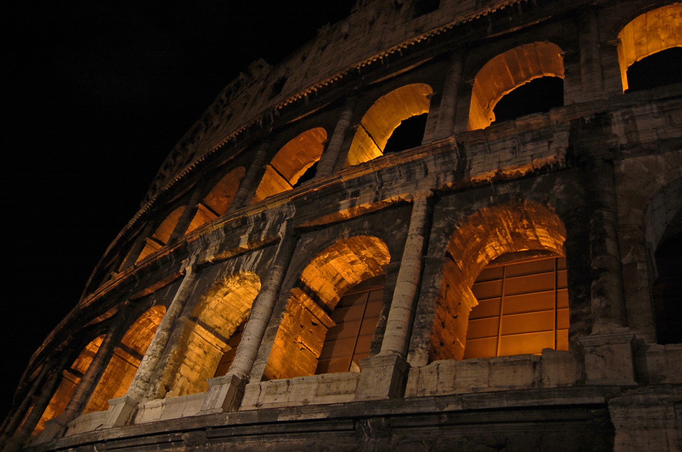
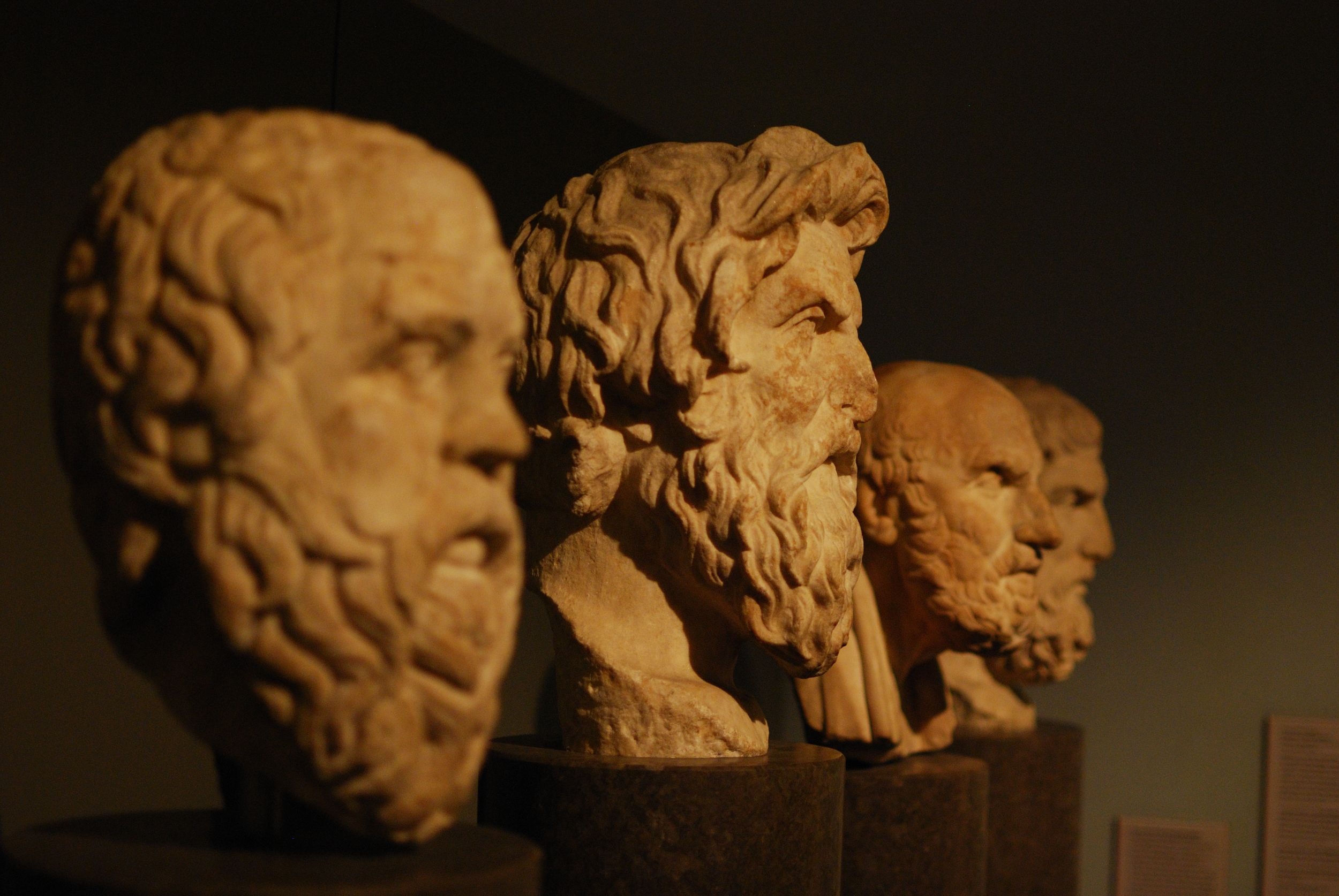
The eCore template comes with a ready-to-use collection of background images for use in the background tag of the header section (see Features for more details). These backgrounds are stored in the backgrounds folder inside the template's assets library, or in other words, at the path assets > backgrounds relative to the template's hosted root directory. As a point of reference, the template's hosted root directory can be found at https://ecore.usg.edu/videos/template. The available backgrounds, their respective source paths, and what subject area they are best suited for, can be found below. To reveal the source path, which will need to be inputted into the src attribute of the img tag inside the headerbackground, simply hover over the image of interest:






















If you would like to request additional backgrounds be added to the background collection, please contact Lauren Hamel at lauren.hamel@ung.edu.
The eCore template offers a wide variety of list markers for use throughout the template. These markers can be accessed through the use of the custom marker attribute on any list tag, which includes:
Refer to the sections below for a complete list of available markers:
Hover over a list item to reveal its marker attribute value.
Hover over a list item to reveal its marker attribute value.
Built into the eCore template are several class presets that can be used for styling things quickly and easily on the fly. These classes are prebuilt values for the class attribute, which apply some preset styling to the element the class is applied to. For an overview of the template's preset classes, see below:
Standing for first-line indent, the .f-indent class indents the first-line of a body of text. The size of the indention is approximately 50px. To learn more about how it works or to see it in action, reference the CSS code, HTML markup, and sample preview below.
.f-indent{ text-indent: 50px; }<p class="f-indent"></p>Lorem ipsum dolor sit amet, consectetur adipiscing elit. Cras laoreet ornare elit, ac maximus justo. Sed varius ante vitae quam sagittis, aliquet gravida mauris consequat. Nunc imperdiet elementum mauris sit amet finibus. Sed ex urna, tincidunt id dolor in, pretium vulputate erat. Duis sagittis dapibus erat, eu hendrerit tortor suscipit id. Ut non pellentesque nisl. Lorem ipsum dolor sit amet, consectetur adipiscing elit.
Standing for small first-line indent, the .f-indent-small class indents the first-line of a body of text. The size of the indention is approximately half the size of the normal .f-indent width (25px). To learn more about how it works or to see it in action, reference the CSS code, HTML markup, and sample preview below.
.f-indent-small{ text-indent: 25px; }<p class="f-indent-small"></p>Lorem ipsum dolor sit amet, consectetur adipiscing elit. Cras laoreet ornare elit, ac maximus justo. Sed varius ante vitae quam sagittis, aliquet gravida mauris consequat. Nunc imperdiet elementum mauris sit amet finibus. Sed ex urna, tincidunt id dolor in, pretium vulputate erat. Duis sagittis dapibus erat, eu hendrerit tortor suscipit id. Ut non pellentesque nisl. Lorem ipsum dolor sit amet, consectetur adipiscing elit.
Standing for big first-line indent, the .f-indent-big class indents the first-line of a body of text. The size of the indention is approximately double the size of the normal .f-indent width (100px). To learn more about how it works or to see it in action, reference the CSS code, HTML markup, and sample preview below.
.f-indent-big{ text-indent: 100px; }<p class="f-indent-big"></p>Lorem ipsum dolor sit amet, consectetur adipiscing elit. Cras laoreet ornare elit, ac maximus justo. Sed varius ante vitae quam sagittis, aliquet gravida mauris consequat. Nunc imperdiet elementum mauris sit amet finibus. Sed ex urna, tincidunt id dolor in, pretium vulputate erat. Duis sagittis dapibus erat, eu hendrerit tortor suscipit id. Ut non pellentesque nisl. Lorem ipsum dolor sit amet, consectetur adipiscing elit.
Standing for hanging indent, the .h-indent class indents all lines of a body of text after the first-line. The size of the indention is approximately 50px. To learn more about how it works or to see it in action, reference the CSS code, HTML markup, and sample preview below.
.h-indent{ padding-left: 50px; text-indent: -50px; }<p class="h-indent"></p>Lorem ipsum dolor sit amet, consectetur adipiscing elit. Cras laoreet ornare elit, ac maximus justo. Sed varius ante vitae quam sagittis, aliquet gravida mauris consequat. Nunc imperdiet elementum mauris sit amet finibus. Sed ex urna, tincidunt id dolor in, pretium vulputate erat. Duis sagittis dapibus erat, eu hendrerit tortor suscipit id. Ut non pellentesque nisl. Lorem ipsum dolor sit amet, consectetur adipiscing elit.
Standing for small first-line indent, the .h-indent-small class indents all lines of a body of text after the first-line. The size of the indention is approximately half the size of the normal .h-indent width (25px). To learn more about how it works or to see it in action, reference the CSS code, HTML markup, and sample preview below.
.h-indent-small{ padding-left: 25px; text-indent: -25px; }<p class="h-indent-small"></p>Lorem ipsum dolor sit amet, consectetur adipiscing elit. Cras laoreet ornare elit, ac maximus justo. Sed varius ante vitae quam sagittis, aliquet gravida mauris consequat. Nunc imperdiet elementum mauris sit amet finibus. Sed ex urna, tincidunt id dolor in, pretium vulputate erat. Duis sagittis dapibus erat, eu hendrerit tortor suscipit id. Ut non pellentesque nisl. Lorem ipsum dolor sit amet, consectetur adipiscing elit.
Standing for big first-line indent, the .h-indent-big class indents all lines of a body of text after the first-line. The size of the indention is approximately double the size of the normal .h-indent width (100px). To learn more about how it works or to see it in action, reference the CSS code, HTML markup, and sample preview below.
.h-indent-big{ padding-left: 100px; text-indent: -100px; }<p class="h-indent-big"></p>Lorem ipsum dolor sit amet, consectetur adipiscing elit. Cras laoreet ornare elit, ac maximus justo. Sed varius ante vitae quam sagittis, aliquet gravida mauris consequat. Nunc imperdiet elementum mauris sit amet finibus. Sed ex urna, tincidunt id dolor in, pretium vulputate erat. Duis sagittis dapibus erat, eu hendrerit tortor suscipit id. Ut non pellentesque nisl. Lorem ipsum dolor sit amet, consectetur adipiscing elit.
Standing for paragraph indent, the .p-indent class indents an entire body of text. The size of the indention is approximately 50px. To learn more about how it works or to see it in action, reference the CSS code, HTML markup, and sample preview below.
.p-indent{ padding-left: 50px; }<p class="p-indent"></p>Lorem ipsum dolor sit amet, consectetur adipiscing elit. Cras laoreet ornare elit, ac maximus justo. Sed varius ante vitae quam sagittis, aliquet gravida mauris consequat. Nunc imperdiet elementum mauris sit amet finibus. Sed ex urna, tincidunt id dolor in, pretium vulputate erat. Duis sagittis dapibus erat, eu hendrerit tortor suscipit id. Ut non pellentesque nisl. Lorem ipsum dolor sit amet, consectetur adipiscing elit.
Standing for small paragraph indent, the .p-indent-small class indents an entire body of text. The size of the indention is approximately half the size of the normal .p-indent width (25px). To learn more about how it works or to see it in action, reference the CSS code, HTML markup, and sample preview below.
.p-indent-small{ padding-left: 25px; }<p class="p-indent-small"></p>Lorem ipsum dolor sit amet, consectetur adipiscing elit. Cras laoreet ornare elit, ac maximus justo. Sed varius ante vitae quam sagittis, aliquet gravida mauris consequat. Nunc imperdiet elementum mauris sit amet finibus. Sed ex urna, tincidunt id dolor in, pretium vulputate erat. Duis sagittis dapibus erat, eu hendrerit tortor suscipit id. Ut non pellentesque nisl. Lorem ipsum dolor sit amet, consectetur adipiscing elit.
Standing for big paragraph indent, the .p-indent-big class indents an entire body of text. The size of the indention is approximately double the size of the normal .p-indent width (100px). To learn more about how it works or to see it in action, reference the CSS code, HTML markup, and sample preview below.
.p-indent-big{ padding-left: 100px; }<p class="p-indent-big"></p>Lorem ipsum dolor sit amet, consectetur adipiscing elit. Cras laoreet ornare elit, ac maximus justo. Sed varius ante vitae quam sagittis, aliquet gravida mauris consequat. Nunc imperdiet elementum mauris sit amet finibus. Sed ex urna, tincidunt id dolor in, pretium vulputate erat. Duis sagittis dapibus erat, eu hendrerit tortor suscipit id. Ut non pellentesque nisl. Lorem ipsum dolor sit amet, consectetur adipiscing elit.
The .single-space class sets the line spacing of a body of text to approximately 100%, or the height of 1 line. To learn more about how it works or to see it in action, reference the CSS code, HTML markup, and sample preview below.
.single-space{ line-height: 100%; }<p class="single-space"></p>Lorem ipsum dolor sit amet, consectetur adipiscing elit. Cras laoreet ornare elit, ac maximus justo. Sed varius ante vitae quam sagittis, aliquet gravida mauris consequat. Nunc imperdiet elementum mauris sit amet finibus. Sed ex urna, tincidunt id dolor in, pretium vulputate erat. Duis sagittis dapibus erat, eu hendrerit tortor suscipit id. Ut non pellentesque nisl. Lorem ipsum dolor sit amet, consectetur adipiscing elit.
The .half-space class sets the line spacing of a body of text to approximately 150%, or the height of 1.5 lines. This is the same spacing used by the eCore template by default. To learn more about how it works or to see it in action, reference the CSS code, HTML markup, and sample preview below.
.half-space{ line-height: 150%; }<p class="half-space"></p>Lorem ipsum dolor sit amet, consectetur adipiscing elit. Cras laoreet ornare elit, ac maximus justo. Sed varius ante vitae quam sagittis, aliquet gravida mauris consequat. Nunc imperdiet elementum mauris sit amet finibus. Sed ex urna, tincidunt id dolor in, pretium vulputate erat. Duis sagittis dapibus erat, eu hendrerit tortor suscipit id. Ut non pellentesque nisl. Lorem ipsum dolor sit amet, consectetur adipiscing elit.
The .double-space class sets the line spacing of a body of text to approximately 200%, or the height of 2 lines. To learn more about how it works or to see it in action, reference the CSS code, HTML markup, and sample preview below.
.double-space{ line-height: 200%; }<p class="double-space"></p>Lorem ipsum dolor sit amet, consectetur adipiscing elit. Cras laoreet ornare elit, ac maximus justo. Sed varius ante vitae quam sagittis, aliquet gravida mauris consequat. Nunc imperdiet elementum mauris sit amet finibus. Sed ex urna, tincidunt id dolor in, pretium vulputate erat. Duis sagittis dapibus erat, eu hendrerit tortor suscipit id. Ut non pellentesque nisl. Lorem ipsum dolor sit amet, consectetur adipiscing elit.
The .big-text class increases the size of the font by a fifth the font's original size, setting the font size to approximately 1.20em. To learn more about how it works or to see it in action, reference the CSS code, HTML markup, and sample preview below.
.big-text{ font-size: 1.20em; }<p class="big-text"></p>Lorem ipsum dolor sit amet, consectetur adipiscing elit. Cras laoreet ornare elit, ac maximus justo. Sed varius ante vitae quam sagittis, aliquet gravida mauris consequat. Nunc imperdiet elementum mauris sit amet finibus. Sed ex urna, tincidunt id dolor in, pretium vulputate erat. Duis sagittis dapibus erat, eu hendrerit tortor suscipit id. Ut non pellentesque nisl. Lorem ipsum dolor sit amet, consectetur adipiscing elit.
The .bigger-text class increases the size of the font by a third the font's original size, setting the font size to approximately 1.33em. To learn more about how it works or to see it in action, reference the CSS code, HTML markup, and sample preview below.
.bigger-text{ font-size: 1.33em; }<p class="bigger-text"></p>Lorem ipsum dolor sit amet, consectetur adipiscing elit. Cras laoreet ornare elit, ac maximus justo. Sed varius ante vitae quam sagittis, aliquet gravida mauris consequat. Nunc imperdiet elementum mauris sit amet finibus. Sed ex urna, tincidunt id dolor in, pretium vulputate erat. Duis sagittis dapibus erat, eu hendrerit tortor suscipit id. Ut non pellentesque nisl. Lorem ipsum dolor sit amet, consectetur adipiscing elit.
The .biggest-text class increases the size of the font by a half the font's original size, setting the font size to approximately 1.50em. To learn more about how it works or to see it in action, reference the CSS code, HTML markup, and sample preview below.
.biggest-text{ font-size: 1.50em; }<p class="biggest-text"></p>Lorem ipsum dolor sit amet, consectetur adipiscing elit. Cras laoreet ornare elit, ac maximus justo. Sed varius ante vitae quam sagittis, aliquet gravida mauris consequat. Nunc imperdiet elementum mauris sit amet finibus. Sed ex urna, tincidunt id dolor in, pretium vulputate erat. Duis sagittis dapibus erat, eu hendrerit tortor suscipit id. Ut non pellentesque nisl. Lorem ipsum dolor sit amet, consectetur adipiscing elit.
The .big-text class decreases the size of the font by a fifth the font's original size, setting the font size to approximately 0.80em. To learn more about how it works or to see it in action, reference the CSS code, HTML markup, and sample preview below.
.small-text{ font-size: 0.80em; }<p class="small-text"></p>Lorem ipsum dolor sit amet, consectetur adipiscing elit. Cras laoreet ornare elit, ac maximus justo. Sed varius ante vitae quam sagittis, aliquet gravida mauris consequat. Nunc imperdiet elementum mauris sit amet finibus. Sed ex urna, tincidunt id dolor in, pretium vulputate erat. Duis sagittis dapibus erat, eu hendrerit tortor suscipit id. Ut non pellentesque nisl. Lorem ipsum dolor sit amet, consectetur adipiscing elit.
The .big-text class decreases the size of the font by a third the font's original size, setting the font size to approximately 0.66em. To learn more about how it works or to see it in action, reference the CSS code, HTML markup, and sample preview below.
.smaller-text{ font-size: 0.66em; }<p class="smaller-text"></p>Lorem ipsum dolor sit amet, consectetur adipiscing elit. Cras laoreet ornare elit, ac maximus justo. Sed varius ante vitae quam sagittis, aliquet gravida mauris consequat. Nunc imperdiet elementum mauris sit amet finibus. Sed ex urna, tincidunt id dolor in, pretium vulputate erat. Duis sagittis dapibus erat, eu hendrerit tortor suscipit id. Ut non pellentesque nisl. Lorem ipsum dolor sit amet, consectetur adipiscing elit.
The .big-text class decreases the size of the font by a half the font's original size, setting the font size to approximately 0.50em. To learn more about how it works or to see it in action, reference the CSS code, HTML markup, and sample preview below.
.smallest-text{ font-size: 0.50em; }<p class="smallest-text"></p>Lorem ipsum dolor sit amet, consectetur adipiscing elit. Cras laoreet ornare elit, ac maximus justo. Sed varius ante vitae quam sagittis, aliquet gravida mauris consequat. Nunc imperdiet elementum mauris sit amet finibus. Sed ex urna, tincidunt id dolor in, pretium vulputate erat. Duis sagittis dapibus erat, eu hendrerit tortor suscipit id. Ut non pellentesque nisl. Lorem ipsum dolor sit amet, consectetur adipiscing elit.
The .outline class outlines the object it is applied to using a 1px solid line in eCore dark grey . To learn more about how it works or to see it in action, reference the CSS code, HTML markup, and sample preview below.
.outline{ border: 1px solid #333333; }<p class="outline"></p>Lorem ipsum dolor sit amet, consectetur adipiscing elit. Cras laoreet ornare elit, ac maximus justo. Sed varius ante vitae quam sagittis, aliquet gravida mauris consequat. Nunc imperdiet elementum mauris sit amet finibus. Sed ex urna, tincidunt id dolor in, pretium vulputate erat. Duis sagittis dapibus erat, eu hendrerit tortor suscipit id. Ut non pellentesque nisl. Lorem ipsum dolor sit amet, consectetur adipiscing elit.
The .outline-children class outlines the immediate children of the object it is applied to using a 1px solid line in eCore dark grey . To learn more about how it works or to see it in action, reference the CSS code, HTML markup, and sample preview below.
.outline-children > *{ border: 1px solid #333333; }<p class="outline-children"></p>Lorem ipsum dolor sit amet, consectetur adipiscing elit. Cras laoreet ornare elit, ac maximus justo. Sed varius ante vitae quam sagittis, aliquet gravida mauris consequat. Nunc imperdiet elementum mauris sit amet finibus. Sed ex urna, tincidunt id dolor in, pretium vulputate erat. Duis sagittis dapibus erat, eu hendrerit tortor suscipit id. Ut non pellentesque nisl. Lorem ipsum dolor sit amet, consectetur adipiscing elit.
The .reference class applies traditional reference formatting to a body of text, including hanging indentation and double-spacing, in addition to some custom styling to make reference text obvious but non-obtrusive. To learn more about how it works or to see it in action, reference the CSS code, HTML markup, and sample preview below.
.reference{
display: block;
padding: 5px 10px 5px 40px;
box-sizing: border-box;
background: rgba(243,243,243,0.25);
text-indent: -30px;
text-align: left;
line-height: 200%;
font-size: 0.8rem;
} <p class="reference"></p>Lorem ipsum dolor sit amet, consectetur adipiscing elit. Cras laoreet ornare elit, ac maximus justo. Sed varius ante vitae quam sagittis, aliquet gravida mauris consequat. Nunc imperdiet elementum mauris sit amet finibus. Sed ex urna, tincidunt id dolor in, pretium vulputate erat. Duis sagittis dapibus erat, eu hendrerit tortor suscipit id. Ut non pellentesque nisl. Lorem ipsum dolor sit amet, consectetur adipiscing elit.
The .quote class wraps a body of text in quotation marks. To learn more about how it works or to see it in action, reference the CSS code, HTML markup, and sample preview below.
.quote{
display: block;
}
.quote:before{
content: '“';
}
.quote:after{
content: '”';
} <p class="quote"></p>Lorem ipsum dolor sit amet, consectetur adipiscing elit. Cras laoreet ornare elit, ac maximus justo. Sed varius ante vitae quam sagittis, aliquet gravida mauris consequat. Nunc imperdiet elementum mauris sit amet finibus. Sed ex urna, tincidunt id dolor in, pretium vulputate erat. Duis sagittis dapibus erat, eu hendrerit tortor suscipit id. Ut non pellentesque nisl. Lorem ipsum dolor sit amet, consectetur adipiscing elit.
The .quote-styled class wraps a body of text in stylized quotation marks. To learn more about how it works or to see it in action, reference the CSS code, HTML markup, and sample preview below.
.quote-styled{
display: block;
}
.quote:before{
content: '❝ ';
}
.quote:after{
content: ' ❞';
} <p class="quote-styled"></p>Lorem ipsum dolor sit amet, consectetur adipiscing elit. Cras laoreet ornare elit, ac maximus justo. Sed varius ante vitae quam sagittis, aliquet gravida mauris consequat. Nunc imperdiet elementum mauris sit amet finibus. Sed ex urna, tincidunt id dolor in, pretium vulputate erat. Duis sagittis dapibus erat, eu hendrerit tortor suscipit id. Ut non pellentesque nisl. Lorem ipsum dolor sit amet, consectetur adipiscing elit.
The .quote-by class is used for styling a quote byline. To learn more about how it works or to see it in action, reference the CSS code, HTML markup, and sample preview below.
.quote-byline{
display: block;
margin-top: 10px;
text-align: right;
font-style: italic;
}
.quote:before{
content: '― ';
} <p class="quote-byline"></p>Standing for pronunciation, the .pronun class formats the given text like a pronunciation, adding a / before and after the text. To learn more about how it works or to see it in action, reference the CSS code, HTML markup, and sample preview below.
.pronun{
font-size: 1em;
}
.pronun:before,
.pronun:after{
content: '/';
font-size: 1rem;
} <p class="pronun"></p>Lorem ipsum
The following classes can be used for changing the color of text to a standard eColor.
Changes the text color to eColor's green.
Changes the text color to eColor's teal.
Changes the text color to eColor's light teal.
Changes the text color to eColor's rust.
Changes the text color to eColor's medium orange.
Changes the text color to eColor's light mint.
Changes the text color to eColor's purple.
Changes the text color to eColor's red.
Changes the text color to eColor's light green.
Changes the text color to eColor's yellow.
Changes the text color to eColor's light teal.
Changes the text color to eColor's sky blue.
Changes the text color to eColor's dark purple.
Changes the text color to eColor's coral.
Changes the text color to eColor's mint.
Changes the text color to eColor's turquoise.
Changes the text color to eColor's orange.
Changes the text color to eColor's slate.
Changes the text color to eColor's powder blue.
Changes the text color to eColor's light blue.
Changes the text color to eColor's medium blue.
Changes the text color to eColor's blue.
Changes the text color to eColor's medium teal.
Changes the text color to eColor's dark teal.
Changes the text color to eColor's medium indigo.
Changes the text color to eColor's indigo.
Changes the text color to eColor's dark indigo.
Changes the text color to eColor's dark slate.
Changes the text color to eColor's dark green.
Changes the text color to eColor's light orange.
Changes the text color to eColor's pink.
Changes the text color to eColor's medium coral.
Changes the text color to eColor's dark coral.
Changes the text color to eColor's dark red.
Changes the text color to eColor's black.
Changes the text color to eColor's dark-grey. This is also the template's default font color.
Changes the text color to eColor's dark-gray. This is also the template's default font color.
Changes the text color to eColor's light grey.
Changes the text color to eColor's light gray.
Changes the text color to eColor's white.
The following classes can be used for applying a solid background color to an element.
Changes the background color to eColor's .
Changes the background color to eColor's .
Changes the background color to eColor's .
Changes the background color to eColor's .
Changes the background color to eColor's .
Changes the background color to eColor's .
Changes the background color to eColor's .
Changes the background color to eColor's .
Changes the background color to eColor's .
Changes the background color to eColor's .
Changes the background color to eColor's .
Changes the background color to eColor's .
Changes the background color to eColor's .
Changes the background color to eColor's .
Changes the background color to eColor's .
Changes the background color to eColor's .
Changes the background color to eColor's .
Changes the background color to eColor's .
Changes the background color to eColor's .
Changes the background color to eColor's .
Changes the background color to eColor's .
Changes the background color to eColor's .
Changes the background color to eColor's .
Changes the background color to eColor's .
Changes the background color to eColor's .
Changes the background color to eColor's .
Changes the background color to eColor's .
Changes the background color to eColor's .
Changes the background color to eColor's .
Changes the background color to eColor's .
Changes the background color to eColor's .
Changes the background color to eColor's .
Changes the background color to eColor's .
Changes the background color to eColor's .
Changes the background color to eColor's .
Changes the background color to eColor's
Changes the background color to eColor's
Changes the background color to eColor's .
Changes the background color to eColor's .
Changes the background color to eColor's .
The following classes can be used for creating a linear gradiant background effect like that of the page title.
Changes the background color to eColor's .
Changes the background color to eColor's .
Changes the background color to eColor's .
Changes the background color to eColor's .
Changes the background color to eColor's .
Changes the background color to eColor's .
Changes the background color to eColor's .
Changes the background color to eColor's .
Changes the background color to eColor's .
Changes the background color to eColor's .
Changes the background color to eColor's .
Changes the background color to eColor's .
Changes the background color to eColor's .
Changes the background color to eColor's .
Changes the background color to eColor's .
Changes the background color to eColor's .
Changes the background color to eColor's .
Changes the background color to eColor's .
Changes the background color to eColor's .
Changes the background color to eColor's .
Changes the background color to eColor's .
Changes the background color to eColor's .
Changes the background color to eColor's .
Changes the background color to eColor's .
Changes the background color to eColor's .
Changes the background color to eColor's .
Changes the background color to eColor's .
Changes the background color to eColor's .
Changes the background color to eColor's .
Changes the background color to eColor's .
Changes the background color to eColor's .
Changes the background color to eColor's .
Changes the background color to eColor's .
Changes the background color to eColor's .
Changes the background color to eColor's .
Changes the background color to eColor's
Changes the background color to eColor's
Changes the background color to eColor's .
Changes the background color to eColor's .
Changes the background color to eColor's .
Any number of classes can be combined to create the desired look and feel. When chaining classes in the class attribute, be sure to use only spaces to separate your different class attribute values. Below is an example of more than one class being applied to a single element:
<p class="f-indent double-space">
    The first line of this text will be indented and all of the text will be double-spaced.
</p>
When chaining multiple classes together, it's important to remember any classes manipulating the same CSS property or group of properties will cancel each other out. In this instance, only the class that you listed last in your class attribute list will be the one that takes effect. For example, if you were to use classf-indent h-indent, because both .f-indent and .h-indent use the same text-indent property, the resulting text-indent would have the value of -50px because the h-indent class was listed last. In this example, the f-indent class value is thus canceled out.
If you would like to request additional classes be added to the built-in classes set, please contact Lauren Hamel at lauren.hamel@ung.edu.
Plugins are prebuilt extensions, usually by other people, that can be used to add some functionality to a page. Think of them as a means to prevent reinventing the wheel metaphorically speaking, or a quick and dirty way to create some new functionality on a large, reproducible scale with little to no effort. In this case, plugins have been used to expedite the template development process and add additional functionality to the template. The plugins being used and their purposes are as follows:
Used as an adapted version of the original, this plugin makes media captions and attribution possible. It works by wrapping captioned objects in a figure and adding caption and attribution text to the figure element's native figcaption. For more on adding captions and/or attributions, see the section on template Features.
Used as an adapted version of the original, this plugin automatically resizes any videos that use an iframe. Since iframe elements require a specific width and height, this plugin works by resizing iframe videos according to their original aspect ratio. In order to invoke this plugin so that an iframe video is resized, the iframe element must be given the fluid attribute. No value is needed, but the fluid attribute itself is needed in order to flag the iframe element for resizing. For more on how fluidwidth video resizing is used, check out the Features section of this template.
Used as an adapted version of the original, this plugin truncates long title text in the nav bar and floating side menu with an ellipsis (...). It works by limiting the number of lines of text to one line and restricting the text to the designated area. It adds ellipsis where text would otherwise wrap to a new line or spill over into a nondesignated area. For more on the nav bar or floating side menu, visit the Features section of the template.
Used as an adpated version of the original, this plugin does the bulk of the workload involved in crafting the grid layouts. It works by calculating the available space inside the grid and positioning each griditem accordingly based on its "best fit" given the varying widths and heights of each griditem. For more about how grid layouts work, see the section on template Features.
Developed specifically for eCore template applications, this plugin synchronizes transcript element scrolling with the respective video or audio element's playback. It works by capturing the time for each transcripted line, converting it to a position within the video's or audio's duration, and comparing the video's current playback time against the transcription's timing. When the video or audio player reaches a time that is equal to or greater than a transcripted line's time but not greater than the time for the next transcripted line, that specific line is highlighted, and the transcript box scrolls to that particular line, making sure it's easily within the user's viewing pane. For more about how transcript elements work, see the section on template Features.
Developed specifically for eCore template applications, this plugin converts standard HTML5 video elements to a fully customized, accessible, and responsive video player. It works by looking for video elements that are missing their controls attribute, which signals the plugin to create a custom set of controls, as well as additional features, that have been modified to be mobile- and disability-friendly. For more about how this custom video player works, see the section on template Features.
Developed specifically for eCore template applications, this plugin enables instantaneous definition lookups on vocabulary terms when a user mouses over or focuses on any given vocabulary word. It works by looking for vocabulary terms that have been wrapped in a special define tag, which contains a link to an XML document in its xmlsrc; retrieving, opening, and reading the XML document, which resembles a glossary-like list of definitions; finding, fetching, and saving the relevant definition, which matches the given term; and creating a temporary preview of the term's definition. For more about how to configure and use this define element, see the section on template Features.
The above plugins are dependent on the use of jQuery, an extension of the JavaScript library. At present, the template uses jQuery version 1.12.3 since it contains backwards support for older Internet Explorer browsers. Additional jQuery-based libraries such as jQuery Mobile and the unofficial Detect Mobile Browsers plugin are also being used by the template but are primarily used behind the scenes and do not add any additional front-end functionality.
Creating external links is always easy. An external link, or a tag, can be created using the built-in hyperlink builder from the WYSIWIG editor or hand-coded in the the format below, where the href attribute is used for the link's address, such as a URL or email address, and the title tag is used for accessibility purposes (for more details on accessibility, read the section on Accessibility):
<a href="" alt="" title="">For external links, an a tag can be used for several types of addresses. As previously mentioned, URLs and email addresses are two of the most common use case scenarios. The list below goes into further detail about some of the more popular types of link addresses and how they are used inside the href attribute of the the a tag:
Absolute URLs are your traditional URL, beginning with a web protocol, such as http:// or https://, and ending with the domain address.
<a href="http://www.example.com">Relative URLs are in the form of a directory structure, referring to the underlying files and folders which make up of the current site and relative to the current file's location within the folder tree unless otherwise specified.
<a href="folder/file.ext">In addition, any of the below prefixes can be used in order to change the relativeness of a relative path:
Prefixed with mailto:, clicking a hyperlinked email address triggers a "Compose New Message" window in the user's default email platform to the given email recipient.
<a href="mailto:johndoe@example.com">In some cases, you may want to have multiple recipients in your mailto: link. Additional recipients can be added by separating them with a comma (,). In addition to adding recipients, mailto: addresses can be customized in other ways. For instance, using any of the below suffixes will precompose different parts of the email message:
None or all of the suffixes can be used at any given time. When adding suffixes, you use a ? before the first suffix. Additional suffixes are then chained with an & before them.
Prefixed with tel:, clicking a hyperlinked tel: number from a mobile device or any desktop computer with calling software triggers a phone call to the given telephone number. Using a country code, such as +1 for US telephone numbers, is advised for best results.
<a href="tel:+15555555555">Prefixed with sms:, clicking a hyperlinked sms: number from a mobile device triggers a new text message to the given telephone number while clicking from a desktop computer will have no effect. Using a country code, such as +1 for US telephone numbers, is advised for best results.
<a href="sms:+15555555555">In some cases, you may want to have multiple numbers in your sms: link. Additional numbers can be added by separating them with a comma (,). In addition to adding numbers, sms: addresses can be customized in other ways. For instance, using the below suffix will precompose different parts of the text message:
When adding the suffix, you use a ? before it.
Prefixed with skype:, clicking a hyperlinked skype: username or number from a mobile device or desktop computer with Skype installed triggers a new Skype call to the given recipient unless the default Skype link behavior is changed. When using a phone number, it's recommended that you prefix the number with its respective country code, such as +1 for US telephone numbers.
<a href="skype:user">In some cases, you may want to have multiple recipients in your skype: link. Additional numbers can be added by separating them with a semicolon (;). In addition to adding recipients, skype: addresses can be customized in other ways. For instance, using any of the below suffixes will change the default Skype link behavior accordingly:
Only one of the above suffixes can be added at time. When adding the suffix, you should use a ? before it.
Along with links to external sources, internal links can be used to make navigating the current page easier or for referencing content located somewhere else in the page. Because in-page links utilize a smooth scrolling system, creating an internal link is slightly different from how you would create a standard a tag. As a guide, follow the example below when creating internal links:
<a href="javascript:void(0)" jumpto="section-#" onclick="jump(this);">For all internal links, the href attribute of the a tag should be voided using javascript:void(0). Using javascript:void(0) removes the default behavior of the a tag, enabling us to create our smooth scrolling link. The jumpto attribute is then used to specify the section within the current page that we wish to go to when our link is clicked. The jumpto attribute will always have a value identical to section-# where the # is replaced with the section number. Sections are always numbered top-down, meaning that your first section will always be section-1, second section will always be section-2, and so forth for each section in your document. Lastly, the remaining attribute in the a tag above and its corresponding value, onclickjump(this);, are required. This is the function that creates the smooth scrollling effect when our link is clicked.
Various templates have been setup and made available to help expedite the course development process. These HTML template files can be found in the root template folder, each file starting with _template and containing the .html extension. While these templates are intended to help make course development quickier and easier, do note that these templates have been made to be very minimilistic and, thus, do not fully reflect all available Features that have been mentioned throughout this template guide.
By and large, these templates are designed to serve as a foundation for you to build upon by adding layout elements, utilizing features, and customizing styles as outlined in this guide. A total of 14 templates currently exists with their layouts mirroring the visual representations below. Hovering over each visual will reveal the name of its cooresponding HTML template file:
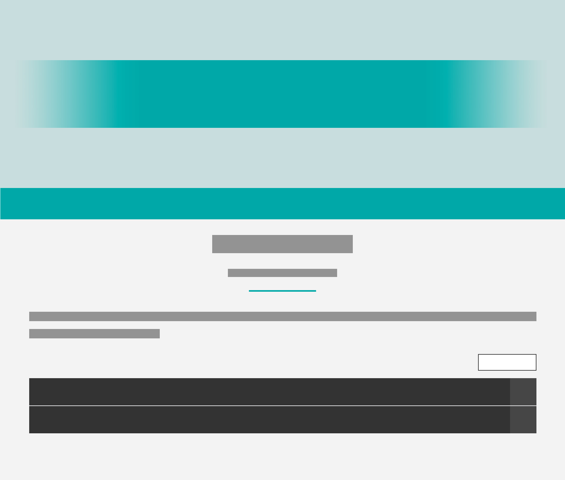

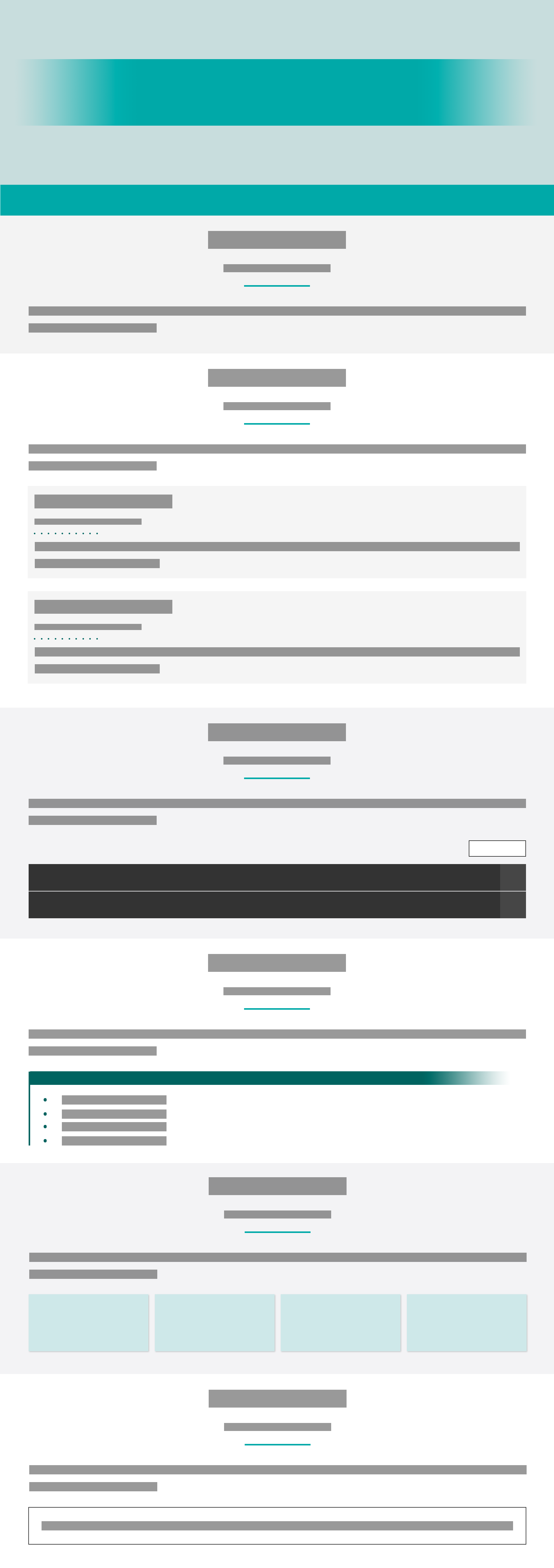

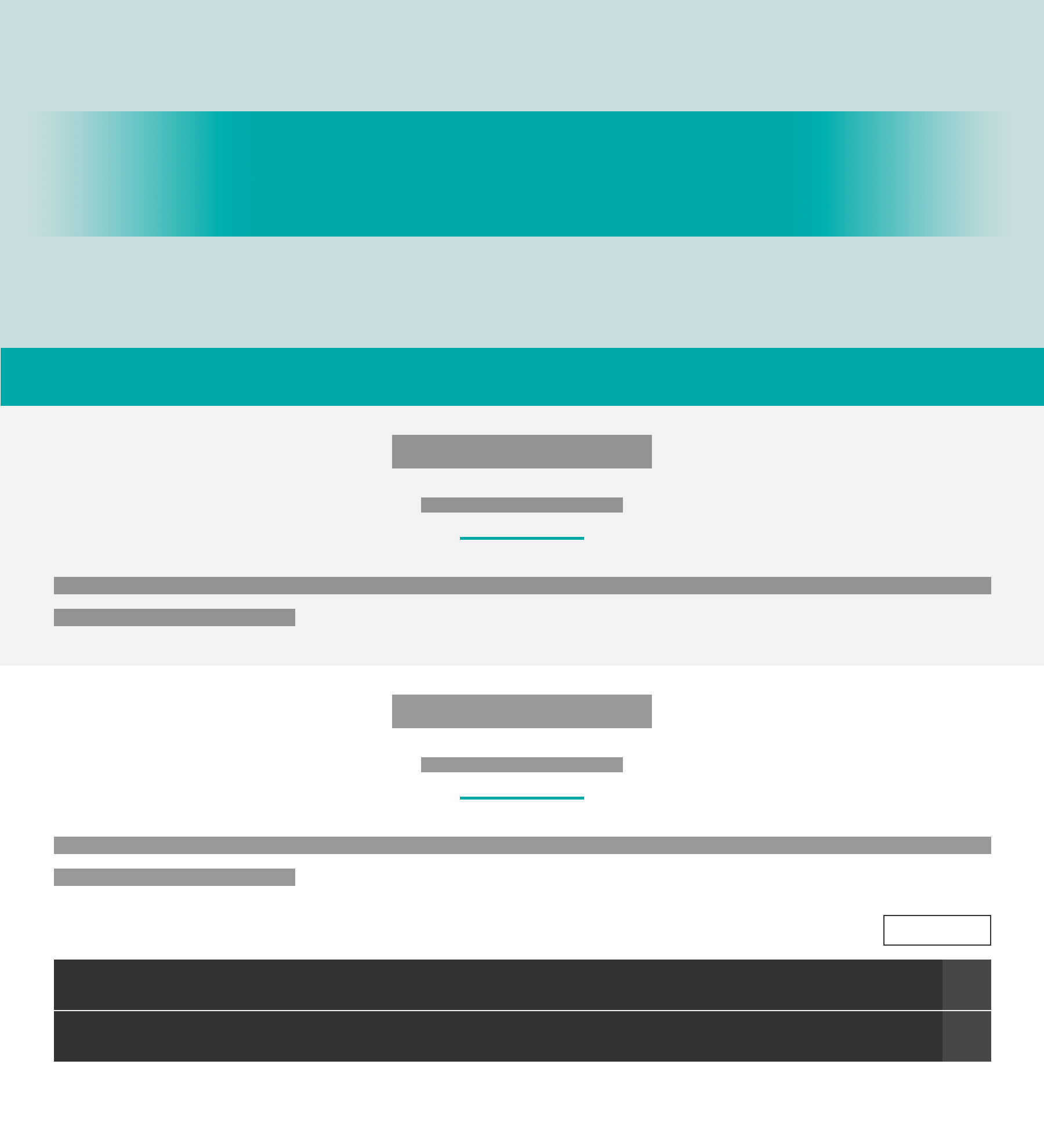


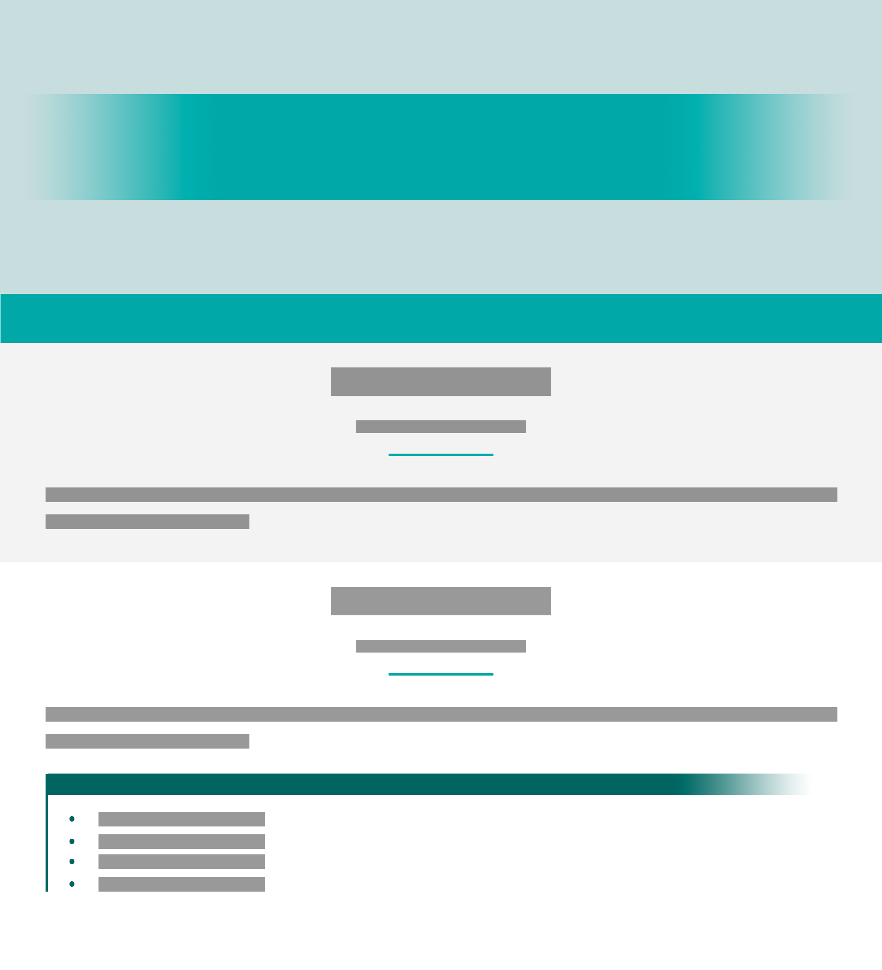

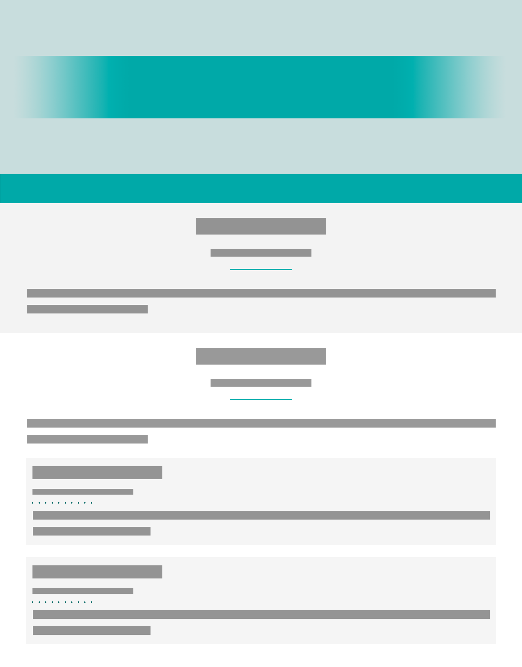
If you would like to request additional templates be created, please contact Lauren Hamel at lauren.hamel@ung.edu.
As a requirement for 508 compliance, this template has been created with accessibility features at the forefront of its design. The template's accessible feature include but are not limited to the following:
The entire template has been made tabbable, including all standard tabbable elements as well as some nonstandard tabbable elements, like the bulk of the page's text content. In other words, students should be able to use the TAB and SHIFT+TAB keys to scan the page's entire content without missing any text, links, buttons, and so forth. This feature is added dynamically at page load by indexing the entire page and adding tabindex0 to all targeted content.
While tabbing through the page, you will also notice a dotted focus ring being applied to the element that has been tabbed to and is in focus. This focus ring is intended to help students figure out where they are on the page. To make this focus ring even more helpful, this focus ring has been made to slowly pulse, or enlarge then shrink back to normal size, every so often after one minute (60s) of inactivity. This focus ring can also be hidden completely from view by using the ESC key while the current tab order will be retained.
A big part of 508 compliance relates to the ability of screen readers to accurately read through the contents of a page. The template has been designed with this necessity not only in mind but at the forefront of its design. Thus, the template reflects a fully readable layout and markup, including readbility by the LMS's built-in "Listen" button powered by ReadSpeaker. Yes, this even means that elements that may appear to be visually hidden will be read aloud.
In addition to the template's readability by screen readers, the template has also been designed with the goal of making all HTML markup readable by and understandable to the people who will be manipulating the template the most. With this in mind, the template has been designed fully in semantic HTML5, where every element's name is intended to clearly describe its use and/or purpose.
Tooltips are used to provide additional information about an element on the page. Usually, a tooltip is shown when an element containing a title attribute is moused over (on hover), but the template's tooltip feature has been enhanced to also show a pseudo tooltip when an element containg a title attribute is tabbed to (in focus).
While this improvement to tooltips makes a significant difference in how accessible the title attribute is, it's important to note that it's not perfect. Unfortunately, the pseudo tooltip method does not work on all elements. For instance, this pseudo approach is not compatible with the img tag even though tooltips should still be displayed on hover of the image.
Though this is not related to the template's built-in accessibility features, it's an important accessibility requirement that instructional designers and anyone else who may manipulate this template should know. Alternative text and the use of the alt attribute of img tags is a huge factor in accessibility compliance. Because the alternative text is what's read by screen readers, it's important to always fill in the alt attribute with a meaningful description of the visual. Of course, the exception to using the alt attribute is if an image is purely decorative. Only when an image is decorative can the alt attribute be omitted.
While this template is intended to be fully accessible, it may not be perfect. Please pass on any issues or concerns regarding accessibility compliance to Lauren Hamel at lauren.hamel@ung.edu.